1.1 Analyzing Categorical Data
c. Pie Charts & Bar Charts
Download the .rmd file, which you can run yourself in your installation of R, here.
In this tutorial, we’re going to look at two ways of visually representing data in R – through a pie chart and bar chart.
First, we’ll load up a dataset that’s actually built right into R’s
platform – mtcars.
#importing the data
attach(mtcars)
Let’s check out what mtcars includes:
summary(mtcars)
##       mpg             cyl             disp             hp
##  Min.   :10.40   Min.   :4.000   Min.   : 71.1   Min.   : 52.0
##  1st Qu.:15.43   1st Qu.:4.000   1st Qu.:120.8   1st Qu.: 96.5
##  Median :19.20   Median :6.000   Median :196.3   Median :123.0
##  Mean   :20.09   Mean   :6.188   Mean   :230.7   Mean   :146.7
##  3rd Qu.:22.80   3rd Qu.:8.000   3rd Qu.:326.0   3rd Qu.:180.0
##  Max.   :33.90   Max.   :8.000   Max.   :472.0   Max.   :335.0
##       drat             wt             qsec             vs
##  Min.   :2.760   Min.   :1.513   Min.   :14.50   Min.   :0.0000
##  1st Qu.:3.080   1st Qu.:2.581   1st Qu.:16.89   1st Qu.:0.0000
##  Median :3.695   Median :3.325   Median :17.71   Median :0.0000
##  Mean   :3.597   Mean   :3.217   Mean   :17.85   Mean   :0.4375
##  3rd Qu.:3.920   3rd Qu.:3.610   3rd Qu.:18.90   3rd Qu.:1.0000
##  Max.   :4.930   Max.   :5.424   Max.   :22.90   Max.   :1.0000
##        am              gear            carb
##  Min.   :0.0000   Min.   :3.000   Min.   :1.000
##  1st Qu.:0.0000   1st Qu.:3.000   1st Qu.:2.000
##  Median :0.0000   Median :4.000   Median :2.000
##  Mean   :0.4062   Mean   :3.688   Mean   :2.812
##  3rd Qu.:1.0000   3rd Qu.:4.000   3rd Qu.:4.000
##  Max.   :1.0000   Max.   :5.000   Max.   :8.000
As you can see, this dataset has a number of variables that can be
measured on cars. The one we’ll focus on first is gear, which tells us
the number of gears each car in the dataset has. Just to get a handle on
what we can expect, let’s look at a frequency table of gear using the
$ operator to tell R that we want to look within the mtcars dataset:
table(mtcars$gear)
##
##  3  4  5
## 15 12  5
This (very basic) table tells us that there are 15 cars with 3 gears, 12 with 4 gears, and 5 with 5 gears in our dataset.
First, we’ll create a pie chart to summarize this distribution:
#pie chart with the pie() function
slices = c(15, 12, 5)
labels.pie = c("3 gears", "4 gears", "5 gears")
pie(slices,
    labels=labels.pie)
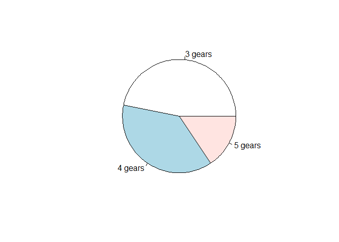
This does the trick!
If you want a slightly better looking pie chart, we can create one using
the ggplot2 package. First, install the package using the following
chunk. I have commented out (with a #) the line that will install the
package for you, so just add it back in by removing the # and run the
chunk!
#install.packages("ggplot2")
Now, we can use the ggplot2 package to create a slightly nicer pie
chart. This function has a bunch of arguments, which I’ll break down for
you.
#ggplot2 pie chart
library(ggplot2)
## Warning: package 'ggplot2' was built under R version 4.1.3

##
## Attaching package: 'ggplot2'

## The following object is masked from 'mtcars':
##
##     mpg
pieframe = data.frame(slices, labels.pie)
ggplot(pieframe, aes(x="", y=slices, fill=labels.pie)) +
  geom_bar(stat="identity", width=1) +
  coord_polar("y", start=0) +
  theme_void() +
  geom_text(aes(label = paste0(slices, " cars")), position = position_stack(vjust=0.5)) +
  labs(x = NULL, y = NULL, fill = NULL)
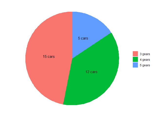 First,
because the
First,
because the ggplot function expects a dataframe input, we had to
create a dataframe (combining the variables slices and labels.pie
that we created in our earlier pie chart endeavor) called pieframe.
We pass ggplot the pieframe data, then identify some “aesthetics”
through aes() that we want to include in the plot: namely, slices
and labels.pie. A full explanation of how ggplot uses aesthetics is
beyond the scope of what we need to do here, although we may touch on
this function again throughout the course.
We then tell ggplot to make us a geom_bar(). (Wait, what?? We’re
telling it to make us a bar chart?) Sure – but we’re going to input the
heights of the bars in polar fashion (coord_polar("y", start=0)) so
they tell ggplot how much to rotate around a central axis instead of
how tall to make the bars. This function isn’t really meant to create
a pie chart, but we are able to convince it to do it for us with this
input!
The rest of our arguments are just for making a pretty pie chart.
theme_void() gets rid of some messy background graphics that ggplot
includes by default, and geom_text() inputs the labels into each
slice. Again, because we won’t be using ggplot all the time, I’m
intentionally glossing over some of the details here.
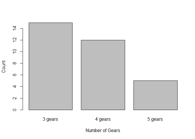
Similarly, we can craft a bar chart to present the data:
barplot(slices,
        names.arg=labels.pie,
        xlab = "Number of Gears",
        ylab = "Count")
Alternately, we can use ggplot again to create a bar chart:
#ggplot2 bar chart
library(ggplot2)
ggplot(data=pieframe, aes(x=labels.pie, y=slices)) +
  geom_bar(stat="identity") +
  labs(x="Number of Gears", y="Count")
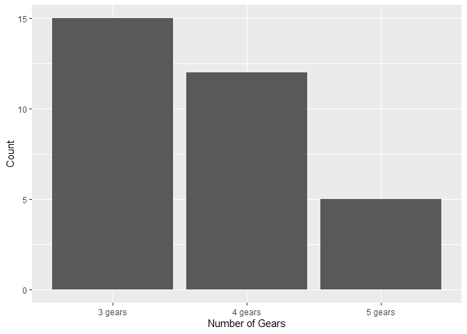
Here, the ggplot arguments may be a bit easier to interpret (since we
aren’t trying to convince geom_bar() to make us a pie chart this
time!). As you can see, the x-axis shows the categorical variable
labels.pie from our pieframe data, while the y-axis shows the count
variable slices. We then create a geom_bar() that takes that
information and crafts a bar chart out of it. We’ve also added labs()
to label the axes.